News Summary
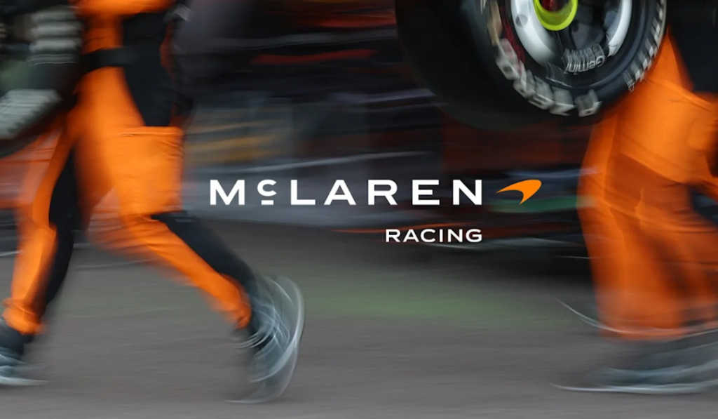
- McLaren has introduced a unified visual identity across its Racing and Automotive divisions
- The redesigned wordmark references the Auckland service station where Bruce McLaren built his first racing car
- The Speedmark, papaya and Speedy Kiwi have been retained, preventing the update from erasing McLaren’s strongest symbols
McLaren has unveiled a new visual identity designed to connect its past, present and future across both its racing and automotive operations.
At the centre of the redesign is a revised wordmark featuring a line beneath the letter C. The detail was inspired by the sign displayed above the service station owned by Bruce McLaren’s parents, Les and Ruth, in Remuera, Auckland.
It was there that McLaren worked on the Austin 7 with which he began competing. Rather than relying exclusively on the papaya racing cars familiar to modern audiences, the company has returned to the earliest chapter of its founder’s career.
The wider identity includes a bespoke typeface named McLaren Sans and an expanded colour palette inspired by different periods in the company’s history. The established Speedmark remains, alongside papaya and the Speedy Kiwi.
That decision prevents the project from becoming another corporate redesign in which recognisable details are removed simply to make a logo appear cleaner on a smartphone screen.
Did McLaren really need a new identity?
Not necessarily. McLaren’s existing symbols were neither outdated nor difficult to recognise. The Speedmark remains one of the most identifiable shapes in motorsport, while papaya has become inseparable from the modern McLaren Formula 1 team.
However, McLaren now needs to communicate as considerably more than an F1 constructor or supercar manufacturer. Its racing operation spans Formula 1, IndyCar and endurance competition, with a Hypercar programme being prepared for the 2027 World Endurance Championship.
A unified system therefore has a practical purpose. It must work on an F1 rear wing, an IndyCar transporter, a road car, team clothing and digital platforms without making McLaren appear to be several unrelated companies.
The problem begins when practical simplification is presented as artistic progress.
Minimalism has become the safest language in modern branding. Letters are cleaned up, shapes become flatter and colour palettes are reduced. The result normally works well across digital platforms but risks removing the irregularities that made the original identity memorable.
Motorsport should be particularly careful with that instinct. Its most powerful visual identities were rarely restrained. Martini’s stripes, Gulf’s blue and orange, Lotus’ black and gold and McLaren’s papaya succeeded through confidence and immediate recognition—not corporate neutrality.
McLaren restores more than it removes
This is where McLaren’s update is more intelligent than many recent redesigns. It does not abandon the Speedmark or replace papaya with a fashionable neutral colour. Instead, it revises the visual system surrounding its strongest existing assets.
The underlined C is particularly interesting because it introduces an authentic historical reference. For New Zealand supporters, it also places Bruce McLaren’s homeland back at the centre of a story now closely associated with Britain and the company’s Woking headquarters.
There is, however, a limitation. Without the accompanying explanation, few people would look at the small line beneath the C and immediately associate it with the McLaren family’s Auckland service station.
The historical meaning exists, but it has been compressed into a detail that the audience must be taught to recognise. A truly powerful symbol should communicate something before a press release explains it.
McLaren Racing chief marketing officer Lou McEwen said the new identity “feels unmistakably McLaren”. That is broadly correct, although its familiarity comes principally from the Speedmark and papaya rather than the adjusted lettering.
Evolution does not require erasure
McLaren did not need a new identity merely to appear modern. Iconic symbols do not have an expiry date, and simplifying them should never automatically be treated as progress.
What the company required was a coherent visual system capable of connecting its expanding racing programmes, automotive products and digital communication. Judged against that objective, the redesign succeeds.
It takes the least damaging route through contemporary minimalism: restoration rather than erasure. McLaren has preserved the Speedmark, protected papaya and recovered a meaningful detail from Bruce McLaren’s beginnings.
The connection with that history could have been expressed more boldly. Nevertheless, in an era when companies routinely strip away their visual character, McLaren has at least remembered that evolution does not require forgetting.
F1 today: FAQ
When is the next Formula 1 race?
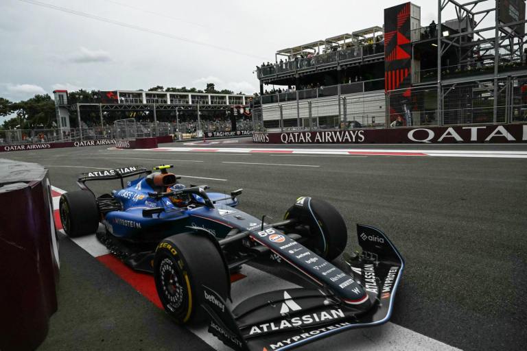
The next race is the 2026 Azerbaijan Grand Prix at the Baku City Circuit on Saturday, 26 September.
Why is the 2026 Azerbaijan Grand Prix being held on Saturday?
The race was moved forward to avoid Azerbaijan’s national Remembrance Day on Sunday, 27 September. Practice begins on Thursday, with qualifying on Friday and the Grand Prix on Saturday.
Who leads the 2026 Formula 1 championship?
Kimi Antonelli leads the Drivers’ Championship with 292 points. Mercedes teammate George Russell is second on 211, leaving Antonelli 81 points ahead with nine rounds remaining.
What has McLaren changed in its visual identity?
McLaren has introduced a revised wordmark, the McLaren Sans typeface and an expanded historical colour palette. The established Speedmark remains part of the identity.